Friday, January 25, 2013

Bedroom Redecoration

After months of planning, researching, designing, moving and  dusting I have finally completed my new room redecoration!!

Here is a visual tour:

 Lord of the Rings inspiration clearly defined before even entering.

The wall opposite the door has my bookcase, display case and built-in wardrobe.

My bookcase used to be shared with hair/jewellery storage and overspilling photo albums. I have cleared it to store ALL my books now (rather than stacked in a dusty corner). It is also in a more prominent location as I wanted the my books to be a feature.

The order of my display boxes has varied slightly, with the more visual elements moved to the higher shelves and more practical storaging pushed below and out of sight. Main features include school signature bears, candles, ornaments and my teaset.

 A closer shot. Photos placed on the top for prominent visual display.

 [I haven't cleaned my mirror yet - whoops] Around my mirror I kept my fan-pictures. Above my cupboard I have re-displayed my main photographs by pegging them onto string. This is a nice eye-pleasing way to display photos.

 This wall is still fairly bare, but as it used to be my busiest I find this quite a refreshing relief! Here I have practical storage of notepaper, unused cards and envelopes, as well as my jewellery storage. Shoes are stored to the left, and spare containers + electical cords to the right.

 I call this my 'Wall of Awesome'. Besides my calendar, I display my biggest fandom posters - Lord of the Rings, Zelda and Phantom of the Opera. [Swan Lake poster didn't fit anywhere else]

 Here you can see a view of my door with funky scarf display [originally used for storing electical cords], my desk for study, and my bed for sleeping :)


Above my bed I display my tickets to plays/musicals/movies/events. Also a row of dwarves (and a hobbit and a wizard).

Here's a close-up of my jewellery display. In reality, it is a lot more cluttered than this, but I removed the clunky stuff for a nice photoshoot. I have separated all my jewellery into different boxes: ribbons, hair ties, bracelets - also a bundle of my headbands/clip-on flowers. My earrings are hung on the cardboard tree I got last Christmas. My necklaces are no longer stuffed into boxes, but hanging nicely on two sticks I collected in the neighbourhood and painted white to blend in. This is probably my favourite part of the whole room.


Before re-designing my room and I set out two criteria to help sort my overcrowding ideas: Functional and Aesthetic requirements. This is a good thought process for designing any room. Here's a copy of my list:

Needing Improvement:
Functionally:
- Makeup/hair/nails/jewellery storage [tick]
- Room for all my books [tick]
- Desk chair support [still need to get a cushion]
- Scarves storage [tick]
- Craft storage [tick] (All my craft-y things are now stored under my bed, with the things most often used (eg: scissors, pencils, string) on my desk in containers)

Aesthetically:
- Curtains [still to be put up]
- Cushions [haha... sometime]
- Hanging photos/cards [tick]

Monday, January 7, 2013

Owl and the Cat - Sewing Projects

(Note: This is the newest of four posts today which cover the Christmas season of craft)
For my baby nephew for Christmas I sewed this owl toy inspired by the design in the book 'Simple Softies', however I made changes such as the use of cotton fabrics instead of felt (except the wings remained felt for functional purposes)


Also from the same book, I redesigned these simple cat toys which I modified to become Christmas decorations. I made a black one for my sister who has a black cat Satie, and a more colourful one which is closer to the design in the book. I never follow the instructions in the design books for some reason, but rather create something based on the pictures with little reference to certain steps of the instructions.
The faces are hand-embroidered and the bodies sewn together on my sewing machine. I also slip-stitched the ribbons and stuff to the pink cat. I disemboweled an unused cushion to use for stuffing.


-AlbusOwner

Painted House Sign

For my parents for Christmas, I finally got round to making a sign for our house!

When we first moved here four years ago we named the house 'Manderley' from the classic book Rebecca. [Spoilers] Yes, in the book Manderley burns down. It wasn't my decision to call our house after that! But it's still a very pretty name.

I wanted a sort of rustic aesthetic. I began with a bare plank of wood that I acquired when some builders were doing some work around the place. The guy was nice enough to sand it down for me which created a great smooth surface to work on.

I kept reading on the internet that it is important to pre-treat the wood, but I skipped this step. If you want to do this professionally, then I suggest you research elsewhere for pretreatments. I used white acrylic paint to cover the surface with two coats and then mixed the white with blue to create a pale vintage colour for the lettering. After the lettering dried I went over the letters with a smaller brush to fix up any wobbly lines.


 For the lettering I used Script MT Bold font on a word document, then printed it out and cut it out to create a stencil. I penciled in the lettering and then painted over.

I also downloaded a leafy design and used the same method for painting around the edges.


There's still some post-treatments to do to protect it from the elements as it will be sitting outside for years to come, so I will try to remember to take pictures when it is up on our house!

-AlbusOwner

Zelda Triforce

So this is a bit of a weird craft. I made this present for my brother, a pot for his plant with the Hyrule symbol painted on.

This is one for the Zelda fans!

I printed a picture of the insignia and cut it out to create a stencil. As the pot was ridged I knew it was a bad idea to use it as a stencil for painting, so I outlined the insignia with a fabric marker, and then painted following the lines. I'm surprised it turned out so well with all the ridges, but I think it looks quite neat :)


Who doesn't want the Hyrule symbol painted onto their pot plant?!

-AlbusOwner

Hobbit Hole craft

I have a lot of catching up to do with my posts, so here we go!!

With the release of The Hobbit: An Unexpected Journey, I have been delving into a number of hobbit crafts. My first project was Bilbo's sign for Bag End. I tea-dyed the paper with 6 teabags left for 20minutes to create a light shade of old-looking parchment. I then used a calligraphy pen of two sizes to spell out the lettering which I just copied from a still from the movie. (I found the full calligraphy set in an opp shop a few years ago for just $2. No regrets!)


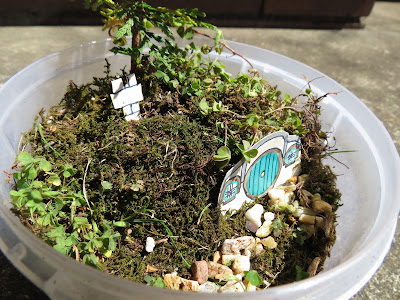
My second project was a real-growing miniture hobbit hole!! It's based of this fabulous original tutorial: Make a Miniture Hobbit Garden.

I began with a base of some glass beads that were just lying around in my room, then with a large layer of potting mix. I uprooted a little plant that was growing in one of our garden pots and replanted it into my hobbit garden. I also uprooted some moss growing around in the shady parts of our backyard. [note: since these photos, the moss has mostly withered. I am not an expert in gardening, but I believe moss requires more water than most plants.]


Final touches include a hobbit door/windows and a chimney. The door is just a piece of cardboard that I designed and coloured [note: the colour in inky pens will run (I learned this the hard way), so using pencil will ensure more long-lasting colour. Look at the original tutorial for a much better solution anyway with clay and paint!]

The door leans against the side of the little mound, but the chimney is attached to a toothpick and secured into the ground.


I hope you enjoyed my Hobbit tutorials!

-AlbusOwner